Bold, Powerful
Logo Design
Blue Steel LLC approached us looking for a logo for their RED HARD NUTRITION brand. They gave us a general idea of what they were looking for, in regards to color scheme & intended audience, but we had creative freedom to give them several different options.
The process of designing RED HARD NUTRITION’s logo began with the client providing some simple sketches of ideas:

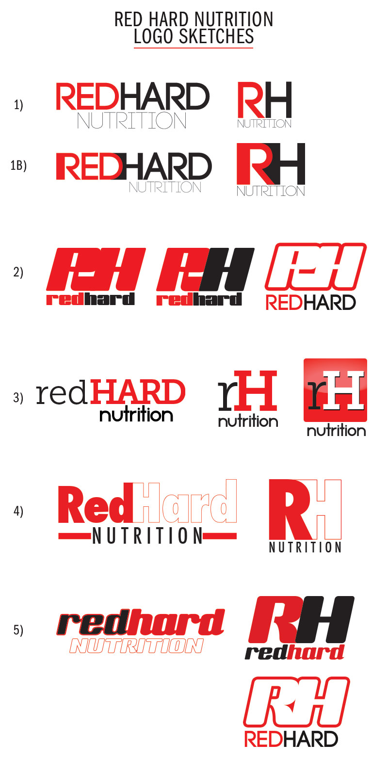
Although sketches aren’t necessary when we design a logo, some clients have a general idea of what they want. In this instance, we took those sketches, along with the information we knew about Red Hard Nutrition, and came to the conclusion that the design must be bold, modern & recognizable. This led to the first round of sketches on our end:
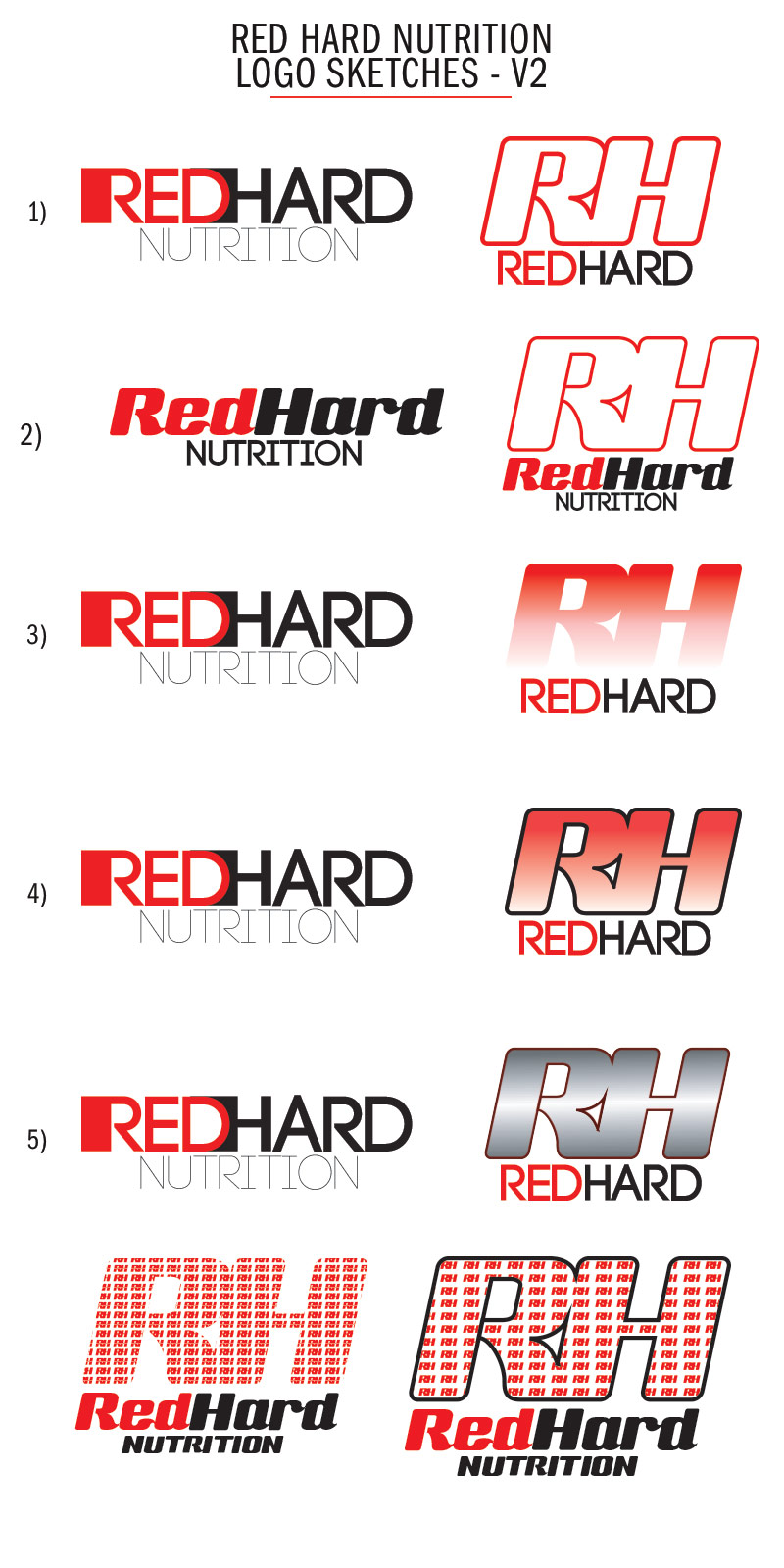
After providing several different logo designs, we worked closely with Blue Steel LLC to determine what they like and don’t like about the various designs. This helps us tweak our designs to make the final set of sketches.
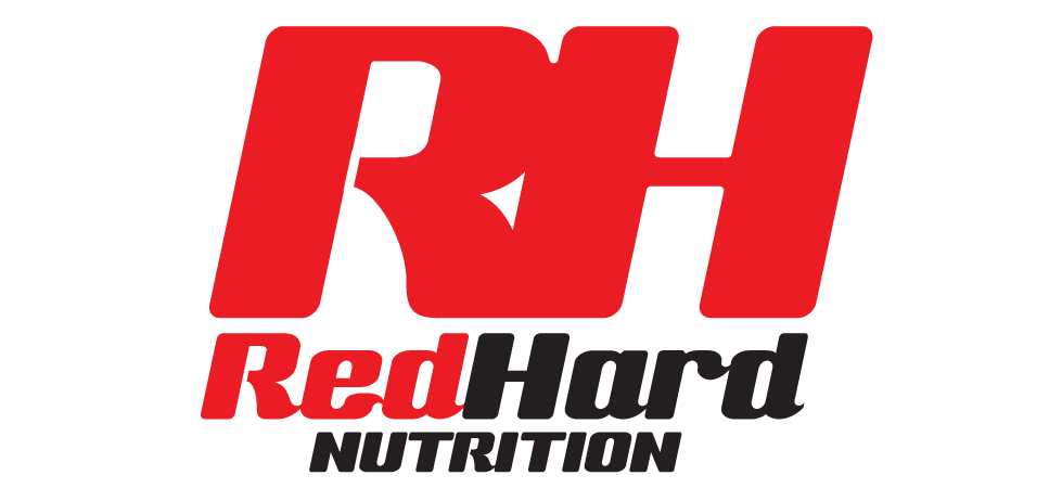
Once the client saw the last round of sketches, we finally were able to pinpoint the exact logo. We provided Blue Steel LLC with the final logo in a few different variations and file formats so they could use their logo in any project.
Here’s a look at the final RED HARD NUTRITION logo:
